Fullsize image: https://diqn32j8nouaz.cloudfront.net...3_fullsize.jpg
https://diqn32j8nouaz.cloudfront.net...1670724013.jpg
Printable View
Interesting. The copyright is 1942 but the image looks, artistically, earlier. I wonder if GE recycled something from a WWI poster.
Indeed, interesting. The possibility of pre 1942 WWII artwork, is there. Most era posters have the artists name, this does not, and the majority are drawings.
Enlarged far as my laptop goes, quite sophisticated in detail, unsure it is drawn, photograph or colorized.
Either way, a very sophisticated artist, depicting a lovely young model.
The shadings are too soft and blended for a colorized photograph. My guess would be something done with artists' pastel chalks.Quote:
Originally Posted by Toolmaker51
The highly expressive face, Norman Rockwell-like aesthetic, and emotionally charged patriotic wording is a hallmark of Sheldon-Claire posters, a now-defunct advertising firm hired by the US government to create these in WWII. Some more examples:
Fullsize image: https://diqn32j8nouaz.cloudfront.net...1_fullsize.jpg
https://diqn32j8nouaz.cloudfront.net...r_victory1.jpg
Fullsize image: https://diqn32j8nouaz.cloudfront.net...2_fullsize.jpg
https://diqn32j8nouaz.cloudfront.net...r_victory2.jpg
https://diqn32j8nouaz.cloudfront.net...r_victory3.jpg
https://diqn32j8nouaz.cloudfront.net...r_victory4.jpg
https://diqn32j8nouaz.cloudfront.net...r_victory5.jpg
More on Sheldon-Claire...
https://fdr.artifacts.archives.gov/p...928e80&idx=868
https://sova.si.edu/record/NMAH.AC.0768
The one of the weeping Frenchman is a colorization of a 1941 photograph showing French citizens watching the the French regimental flags being taken to Africa for safe keeping...
https://photos.com/featured/frenchma...-bettmann.html
so it's a good bet the others are colorizations of war era photos.
Colorization or pastels; either way it's astonishingly realistic artwork.
Most likely aerograph/airbrush over photograph(technique used from last quarter of XIX century).Quote:
Originally Posted by Toolmaker51
Not much has changed has it. Every country has their own version. Every country is always in the right.
Only when a significant populace of another country agrees.Quote:
Originally Posted by mwmkravchenko
But still, not always RIGHT.
Muddled of late, too many overreaching bodies running the show, behind the curtains. That isn't right for anyone.
It's called demonizing the enemy. It would be interesting to see WWII propaganda posters from the Axis countries. However, the losers in wars seldom do a good job of saving the historical artifacts.
Yes, demonizing, the pointy end of propaganda. In the many, many hundreds of such WWII artwork examined, there are few examples from 'our' shores. I don't recall any so grotesque, most depict Axis central figures as clownish. My guess, this is soon after 7 December 1941, even though bombing in Pacific Islands Campaign barely started.
Odd this came up, was thinking about Naval Amphibious Base Coronado, all the street names are Pacific Islands. That delved into Port Hueneme's signifigance, and rest of the day is shot.
https://seabeemuseum.wordpress.com/2...eme-1942-1945/
With endless collection of links at the page bottom
The Japanese were ripe for cartoonish caricaturing; not only had they incited unprecedented US vengeance with the invasion at Pearl Harbor, but they looked physically different from Westerners. This difference in physical appearance might also explain why we interned ten times the number of Japanese Americans as we did German Americans. The Tokio Kid Say posters were a great example of this. There is a good gallery here: https://commons.wikimedia.org/wiki/C...:Tokio_Kid_Say
This one combines the concepts of Rosie the Riveter, saving scrap, and Tokio Kid:
Fullsize image: https://diqn32j8nouaz.cloudfront.net...r_fullsize.jpg
https://diqn32j8nouaz.cloudfront.net...wii_poster.jpg
America has preserved a rich collection of its propaganda posters, but I think the US was objectively superior at creating them, same as the Germans were objectively superior at press forming metal. Of the examples that I have seen, the German posters relied heavily on German gothic font, frequently featured Hitler or idealized versions of the Aryan soldier, and were much more thematically and visually limited. American posters were artistically wide-ranging, emotionally striking, and featured ordinary people.
That being said, this German demoralization leaflet does a good job of copying the style of American propaganda posters:
https://diqn32j8nouaz.cloudfront.net...r_leaflet1.jpg
https://diqn32j8nouaz.cloudfront.net...r_leaflet2.jpg
Those are all very good. Thinking examples commonly found, those widely distributed via Life, Fortune, and other periodicals were a bit conservative. The overt samples might have been displayed more in workplaces, therefore less were preserved? That impression came out with the mention of rivets, not a common term for general public.
Priceless.
I like the WAC in the lower right illustration (the last one in the water) carrying her typewriter.
That typewriter was just as valuable to her so she could type out the Generals orders as those soldier's rifles were to carry out his orders.Quote:
Originally Posted by EnginePaul
"The pen is mightier than the sword". Edward Bulwer-Lytton...
I use bones to make soup and my soup is da bomb...
It is yes; until someone tries to silence it.Quote:
Originally Posted by IntheGroove
the problem with the pen being mightier than the sword, is those yielding the sword should sever the hand holding the pen before the ink was put to paper.
That is probably true for Bulwer-Lytton. Even though he popularized the phrase, he is known for poorly written works. He was also the "it was a dark and stormy night" guy.Quote:
Originally Posted by Frank S
Severing hands might be a little severe; less would fault lopping off selected microphone cords, camera cables and broadcast towers........Quote:
Originally Posted by Frank S
I bet it really "sticks to your ribs" too!! :clapping:Quote:
Originally Posted by IntheGroove
Anyone who can pen a 58-word sentence, only using the word "and" once, while describing the opening setting for the scene of the place where his story takes place. Can not be a complete buffoon.Quote:
Originally Posted by ductape
It was a dark and stormy night; the rain fell in torrentsexcept at occasional intervals, when it was checked by a violent gust of wind which swept up the streets (for it is in London that our scene lies), rattling along the housetops, and fiercely agitating the scanty flame of the lamps that struggled against the darkness.
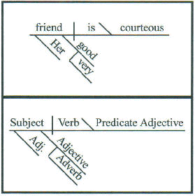
Does anyone remember when we used to diagram sentences school. I would like to see my teacher diagram that one!!! It would take a piece of paper as big as 4 pies, maybe 6 !!!!! (see what I did there?)
Example
Attachment 44963
While I thoroughly enjoyed English classes, diagramming was NOT a highlight.
Yes, we saw.... and very cagey omission of pie type your scale is based on.
A half-dozen fruit turn overs isn't so daunting; that many of Gram's lattice topped Dutch Apple, an entire kitchen counter top.
(See what I did there?)
I've always, as a European history reader (and I studied history) that the quote is correct but for one space and comma: "The penis, mightier than the sword" certainly where arranged marriages between high born families and royalties was concerned.Quote:
Originally Posted by IntheGroove
Ahhhh yes; numerous Hapsburg's and sundry (per)Hapsburg's.
A more convoluted pedigree chart than any Thoroughbred.
Diagramming is tedious; I'd be happy if they would (re)introduce instruction in..Quote:
Originally Posted by Toolmaker51
the distinction between adjectives and adverbs [He did real good.]
the past tense of common verbs [I/we/you/they seen/done it.]
the past participles of common verbs and how to use them correctly [We had went home after the engine had ran.]
the correct form of the auxiliary verbs, e.g. has, have, had, etc.. [I could of done it if I had of knew about it.]
After years of reading forum text, I've come to the conclusion that the average Usonian can not write two hundred words without making fundamental grammar and/or spelling errors.
Likewise, though many have better 'score' speaking vs typing. Somewhere between diction, tense and spelling. Also, why teachers/ editors admonish writers to read their work aloud. Many a phrase looks OK.........
At the same time, good ol' "dark and stormy night" wouldn't be script for a character either.
I was soooo tempted to write 'tents'